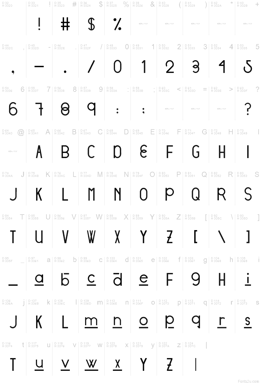
Stratford Sans
ترو تايبمعينة
- اوروبي
Stratford Sans - DEMO.ttf
علامات
ملاحظة المؤلف
DESIGNED BY: Victoria Vandenberg from @BonaFideCraft
The objective of Stratford Sans was to pull from both ends of the spectrum through combining vintage + modern typographic elements to create a font that would seamlessly amalgamate itself into the story of your designs.
Design Process
The initial design process pulled from finding a voice for the city of Stratford, Ontario. The city has a strong scene of traditional arts + culture and is focused on adding digital culture + flair to the mix. The city is expressive, traditional, and unexpected. Therefore, elements tipping a hat to traditional British letterforms and the fluid combination of grotesque era ovals and unforeseen hints of geometric characters are what truly send Stratford Sans into a realm of its own.
The initial design decision was that Stratford Sans would, in fact, be a sans serif font. This is to pull away from its branding of traditional arts and giving it the opportunity to newly define itself, whilst still allowing the magic that is its history, to seep through its characters. Interlacing two conflicting themes gives you the ability to craft a harmony between the two: to pull the exciting and non-negotiable defining elements of each - and defining a new sensation.
خريطة الرموز
لرجاء استخدام قائمة السحب للاسفل لعرض خرائط خط مختلفة داخل الخط الواحد

بيانات الخطوط الاساسية
ملحوظة حقوق الملكية
Copyright (c) 2018 by Victoria Vandenberg - Bona Fide Craft. All rights reserved.
الفئة الخطية
Stratford
الفئة الفصيلية
Regular
تعريف الفئة الفصيلية
VictoriaVandenberg-BonaFideCraft: Stratford Sans: 2018
اسم الخط بالكامل
Stratford Sans
اسم خط الحاشية النصية
Stratford Sans
ملحوظة العلامة التجارية
Stratford Sans is a trademark of Victoria Vandenberg - Bona Fide Craft.
اسم الصانع
Victoria Vandenberg - Bona Fide Craft
المصمم
الوصف
Copyright (c) 2018 by Victoria Vandenberg - Bona Fide Craft. All rights reserved.
بيانات الخطوط الثانوية
المنصات المدعومة
برنامجترميز
الشفرة الدولية الموحدة - يونيكوددلالات الشفرة الدولية الموحدة 2.0 - BMP فقط
ماكينتوشغربي - روماني
مايكروسوفتنظام الحروف الدولي الموحد - BMP فقط
تفاصيل الخط
منشا1969-12-31
المراجعة1
احصاء الصورية العديدة95
الوحدات لكل دقيقة1000
حقوق التضمينالتضمين للمعاينة والسماح بالطباعة
فئة العائلةغير مصنف
الوزنمتوسط إلى خفيف
العرضمتوسط / عادي
نمط الماكغامق
الاتجاهفقط وبقوة من ألايسر الى يمين الرموز + يحتوي على المحايد
طبيعة النمطلعادية
الاهتزازغير موحدة